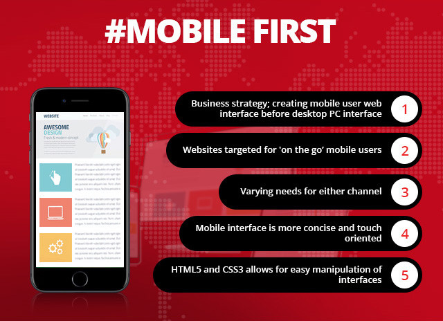
#MobileFirst
Take a walk on the street. Together with the sights of your locale, people walking along with their heads bowed down will come into view; these people are not taking part in some sort of walk of shame. No, they are looking down at their mobile phones in their hands. A common sight these days, the mobile phone has become an integral part of oneself and of the smooth running of the community. Everyone seems to be connected to the internet through these small yet powerful devices. Companies worldwide pushed to involve themselves in this revolution of the fast moving mobile industry. Organizations, small and big, made sure that their virtual stamp would be clearly visible on the mobile phone; without hassle, without clutter.
What is the #MobileFirst strategy?
As the name suggests, this business strategy involves the leading of the mobile phone in the internet race, taking the title away from orthodox desktop PC website settings. Companies worldwide have come to the realization that a huge portion of the human race is now connected online through their smart phones; and these companies want to capitalize on this fact. The #MobileFirst strategy implements the construction of a mobile friendly online user interface before the inception of a desktop PC version. The school of thought that believed in the longevity of people accessing the internet through stationary sources, like a desktop PC, has been overturned by the concept of the mobile phone; where everyone has access to the internet on the go. This makes designing online interfaces a challenge. The websites are now designed keeping mobile users in mind; vice versa to the previously adopted methods of design. This raises the question, “How will users on traditional stationary sources view the websites?” This is where the advancements in technology come into play, making the lives of web designers a breeze.
What are its features?
A traditional desktop user experience differs from a mobile user experience and thus, when adopting the #MobileFirst strategy, there are certain prerequisites that need to be answered. The criterion of audience, behavior and target technology channel must be kept in mind during the design phase.
For a user on a standard desktop PC, the needs required by the user will be quite different from one on the go. For example, if in the case of a car rental website; a desktop PC version will contain prices, pictures of cars available, contact information and so on. But when directing this channel to a mobile user, there are certain other measures that need to be taken into consideration. A person on the go might need a car to be delivered to a certain location or might need GPS coordinates to the nearest rental car branch. This variance in needs forces the web designer to choose different layouts for both interfaces; the desktop version is more information oriented whereas the mobile version, being of touch nature, is more of a concise version containing only the absolute essentials.
During the last few years, statistics have revealed that the sales of mobile phones have exceeded sales of personal computers. This amplifies the need for the #MobileFirst strategy and how its implementation means keeping up with the fast moving intelligent population of today.


